Cargocollective.com/jpleass
http://cargocollective.com/josephpleass

UEL Lecture Series – Tom Hunter

Next in the lecture series - Using an image by the artist on request, with digitally masked Lecture Series logo.
UEL Lecture Series – Sara De Bondt
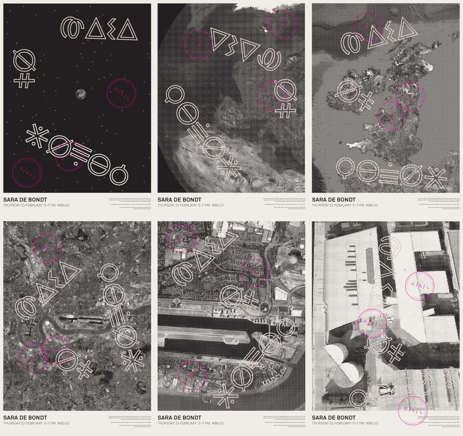
Lecture series poster for Sara De Bondt inspired by her love of the atlas, her extra terrestrial typeface and the Eames powers of ten.
UEL LECTURES – ADAM BROOMBERG & OLIVER CHANARIN

Calm & Collected Covers
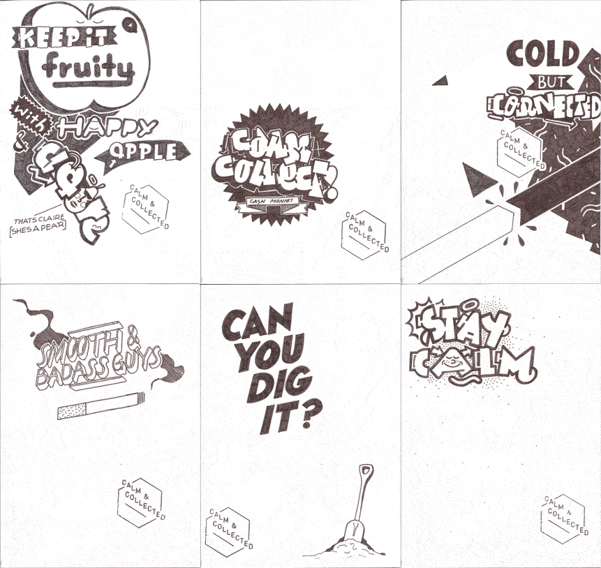
The guys at Calm and Collected hand made all the covers for the latest zine, designed by someone really great. All covers hand draw with pen and pencil.





UEL Lecture Series – Jonathan Barnbrook
As a group we've started branding the universities (UEL) lecture series. We've created a format that we can reproduce each week. It's an A1 digital print we a screen printed stamp/logo over the top which corresponds with which number lecture it is, so the Barnbrook lecture was the third in the series and thus has three stamps. We printed it onto recycled paper, which you can't see in this as I'm just uploading the digital artwork, I haven't photographed the posters yet.


The Open University
Earlier this year I won the opportunity to take part in the Typography Summer School, in which we were briefed with live projects which we had the chance to actually realise on the basis of the clients reaction. I was fortunate enough to be chosen to realise my initial draft copy, and spent studio time at the Frazer Muggeridge Studio working on the final product.
It's now been published and is available for purchase at The Open University event's being held by Marcia Farquhar.


It's now been published and is available for purchase at The Open University event's being held by Marcia Farquhar.


New Roll
These are the highlights from my last couple of rolls, there would be more, but most of them are of the cat.


Notions of You(ty)
While I was in the process of splicing my advertising to create some dialogue on Notions of Beauty in Responsible Design I found myself de-constructing a lot of the language in advertising, noticing a distinct change in audience from advert to television programme.
What I found is whilst television programmes are actually bought for your enjoyment as a viewer, and they are supposedly what you have chosen that channel to watch, they aren't aimed directly at the viewer. The way we watch a lot of Television programmes is as a voyeur, watching something happen that doesn't involve us. For example when I watch the television programme Friends I am watching the lives of six New York yuppies of which my actions have no consequence. Where as when the adverts begin, the audience is directly questioned or referred to, often with assumption that the viewer agrees with or sympathises with the accusations the advert is putting forward.
So this is a thirty second video of every time 'I' was reffered to as an audience member over two advert breaks across a series of channels.
(Sorry the quality isn't great, the lighting in the room affected the exposure from the television)
What I found is whilst television programmes are actually bought for your enjoyment as a viewer, and they are supposedly what you have chosen that channel to watch, they aren't aimed directly at the viewer. The way we watch a lot of Television programmes is as a voyeur, watching something happen that doesn't involve us. For example when I watch the television programme Friends I am watching the lives of six New York yuppies of which my actions have no consequence. Where as when the adverts begin, the audience is directly questioned or referred to, often with assumption that the viewer agrees with or sympathises with the accusations the advert is putting forward.
So this is a thirty second video of every time 'I' was reffered to as an audience member over two advert breaks across a series of channels.
(Sorry the quality isn't great, the lighting in the room affected the exposure from the television)
Deconstruction of the Post-Modernism Exhibition at the V&A
 |
| This is the map I constructed whilst I worked round the gallery |
Post Modernism Exhibition V&A
Layout
The layout of the exhibition was done
with the material increasing chronologically in a timeline. So the
first pieces were dated back from 1968 and ended in around 1997. I
think this was the best way to do it as the exhibition was explaining
the development of Post-modernism and how it came about and its state
now in current society.
The Exhibition was set out across three
rooms, each dealing with a decade of post-modernism, so room one was
1970 room two was 1980 and room three was 1990. The actual layout of
the pieces were designed nicely, you didn't miss anything by
accident. The methods used to make you look at the pieces in the
correct order was simply by direction of the floor plan, you couldn't
avoid going around the exhibition any other way than the way it was
designed.
The only room in which that may have not been the case would be the 'club' room where large TV sets were put high above the floor so you were forced to look up to see them. They were also on a rotation of four or five different TV sets, so to view everything you'd have to have been in the room for a good ten to fifteen minutes.
The exhibition also led you directly into the gallery shop, which was to be expected, as a lot of the income probably comes from book sales.
 |
| Floor Plan for Room 1 |
Lighting
The lighting played a huge part in the
Exhibition, especially in the 'Club' room, where the actual lighting
became part of the exhibition, expressing the visual anarchy of
post-modernism. This was done by just re-creating the coloured
lighting you'd find in a club, and using it to draw focus to
different costumes that were placed around the room.
The lighting for the rest of the
exhibition was pretty dark in most cases, using back lighting for the
majority of the pieces and models in the rooms to draw attention to
them. Some rooms were kept dark enough to use projections in, so this
affected the layout of some pieces. It mean some areas were left
unused as the lighting wasn't sufficient.
The signage also played on the
lighting, by using a lot of neon signage around the exhibition. Not
only did this make it readable in the dark lighting, it also added to
the las vegas pastiche that the exhibition was trying to achieve in
some places.
 |
| Lighting plan for the 'Club' Room |
Signage
The signage was all done by the studio
'APFEL' which is a studio based in Bethnal Green, London. They kept
signage in keeping with each of the sections in the exhibition. This
was done by changing the plastic backing the signage was attached to,
by either changing its colour, or attaching accessories to it. The
signage was pretty clear in its intention, it was always obvious what
it was referring too. This was partly to do with its placement, and
also the accompanying illustrations that showed which of the items it
was referring too, in some of the cabinet sections.
 |
| The information for the pieces on display were treated this way |
The signage used for quotes on the wall were vinyl stickers of the type face 'Compacta', these just looked incredibly nice and didn't change through out the sections. It was one of the elements of the exhibition that stayed pretty consistent through out the gallery.
 |
| Large quote display |
LAND ART EXHIBITION
This is the first part of an ongoing brief, in which I am to propose a hypothetical exhibition on 'Land Art'. The artist I've chosen is Andy Goldsworthy, he's a contemporary Land Artist who creates site-specific Land Art, in his home village of Penpont, Scotland. Photography also plays a large part of his work, as the work is site specific and deteriorates over time, the photography allows him to capture his work for displaying purposes.


I spent a lot of time reading interviews on Goldsworthy and tried to find the underlying concept of his work to rhyme with the way it was exhibited. I noted that photography was important, as was the importance of his work blending with nature, and being at one with it - eventually deteriorating over time. He also is heavily influenced by the idea of the river and the tide, which is the concept that drove my final idea and concept.
The idea I'm proposing for this exhibition is that the gallery is built as a site specific sculpture that acts as a viewing space and a piece of work at the same time. I want to build the gallery at 6m out at sea on foundations off the shore of the village of Southerness. This is an important location, as its the village where the River Nith meets the sea, which is the stream that starts in the village of Penpont, which is where Andy does the majority of his work.
The reason for the gallery being out at sea is I want the tide to dictate the opening time of the gallery, this is done by having access to the gallery across a bridge that is at 6m above sea level, so that when high tide comes in, the bridge and gallery are submerged and then becomes inaccessible. The tidal times for Southerness are quite good as by 10:21am the tide is at its highest and allows till 16:43pm to reach low tide. By my calculations, it means between 10:21 and 12:30pm the gallery will be submerged.

I also want the weather to dictate the experience, so I'd like the gallery to have no roof, meaning that all light would be natural and if it rains, you'd get wet. All the work would be photographic stills and would be behind thick layers of water proofed display cabinets that are in built into the walls. The flooring of the gallery would be made of metal tiling with in built draining, to avoid and pools of water building up after being submerged.


The draining inside the gallery would also be reflecting Andy Goldsworthy's trademark river line work. I've created a 3D model of how I imagine the gallery to look if it were built using Google sketch up. You can also see I've textured it with stone, I like to think that the gallery would be built using stone from the local area, so it has a relevance to Andy's work.


The shape of the building is slanted at the front to act as a wave break for the sea. I've also included a viewing platform at the end of the gallery. I included this as I thought it be a nice reminder of the placement of the gallery, taking full advantage of its 'pier' like quality.

I spent a lot of time reading interviews on Goldsworthy and tried to find the underlying concept of his work to rhyme with the way it was exhibited. I noted that photography was important, as was the importance of his work blending with nature, and being at one with it - eventually deteriorating over time. He also is heavily influenced by the idea of the river and the tide, which is the concept that drove my final idea and concept.
The idea I'm proposing for this exhibition is that the gallery is built as a site specific sculpture that acts as a viewing space and a piece of work at the same time. I want to build the gallery at 6m out at sea on foundations off the shore of the village of Southerness. This is an important location, as its the village where the River Nith meets the sea, which is the stream that starts in the village of Penpont, which is where Andy does the majority of his work.
The reason for the gallery being out at sea is I want the tide to dictate the opening time of the gallery, this is done by having access to the gallery across a bridge that is at 6m above sea level, so that when high tide comes in, the bridge and gallery are submerged and then becomes inaccessible. The tidal times for Southerness are quite good as by 10:21am the tide is at its highest and allows till 16:43pm to reach low tide. By my calculations, it means between 10:21 and 12:30pm the gallery will be submerged.

I also want the weather to dictate the experience, so I'd like the gallery to have no roof, meaning that all light would be natural and if it rains, you'd get wet. All the work would be photographic stills and would be behind thick layers of water proofed display cabinets that are in built into the walls. The flooring of the gallery would be made of metal tiling with in built draining, to avoid and pools of water building up after being submerged.


The draining inside the gallery would also be reflecting Andy Goldsworthy's trademark river line work. I've created a 3D model of how I imagine the gallery to look if it were built using Google sketch up. You can also see I've textured it with stone, I like to think that the gallery would be built using stone from the local area, so it has a relevance to Andy's work.


The shape of the building is slanted at the front to act as a wave break for the sea. I've also included a viewing platform at the end of the gallery. I included this as I thought it be a nice reminder of the placement of the gallery, taking full advantage of its 'pier' like quality.
NOTIONS OF BEAUTY
This is an example of what I've achieved by sampling adverts and re-appropriating their dialogue. I plan to use this same technique for the final version, in which I use Plato's definition of beauty as a juxtaposition to the beauty adverts used as the content.
The definition which I've edited for ease of applying this method too is quoted below;
beauty is the combination of body, soul, and mind as the blending of idea and matter, of reason and pleasure, with proportion serving as the (concept/idea/truth). do not separate (learning) from love or love from beauty. all beauty—seen and heard, external or physical—is animated by its own internal life and contains some meaning. beauty in this sense is the ruling force and the source of life for all living things.
BOOK BOOK
The book is made of text extracted from twelve books to try and string lines together to make a narrative.
Each book is represented in the text by it's original typeface from the original published book, so the differences are subtle. The images for the book were taken from one of the twelve book choices and were used as the text would be.


Each book is represented in the text by it's original typeface from the original published book, so the differences are subtle. The images for the book were taken from one of the twelve book choices and were used as the text would be.


TYPE
Using a computer program that creates randomly placed white block areas on images, I overlapped type specimens removing the white space to try and create new typefaces. These are some of my favourite results.


Subscribe to:
Posts (Atom)